ALDI China
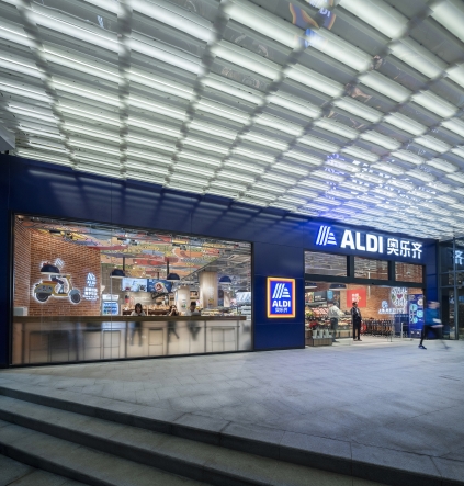
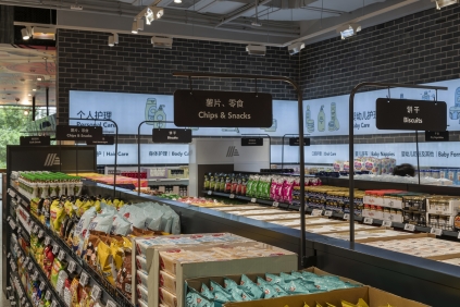
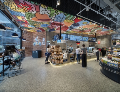
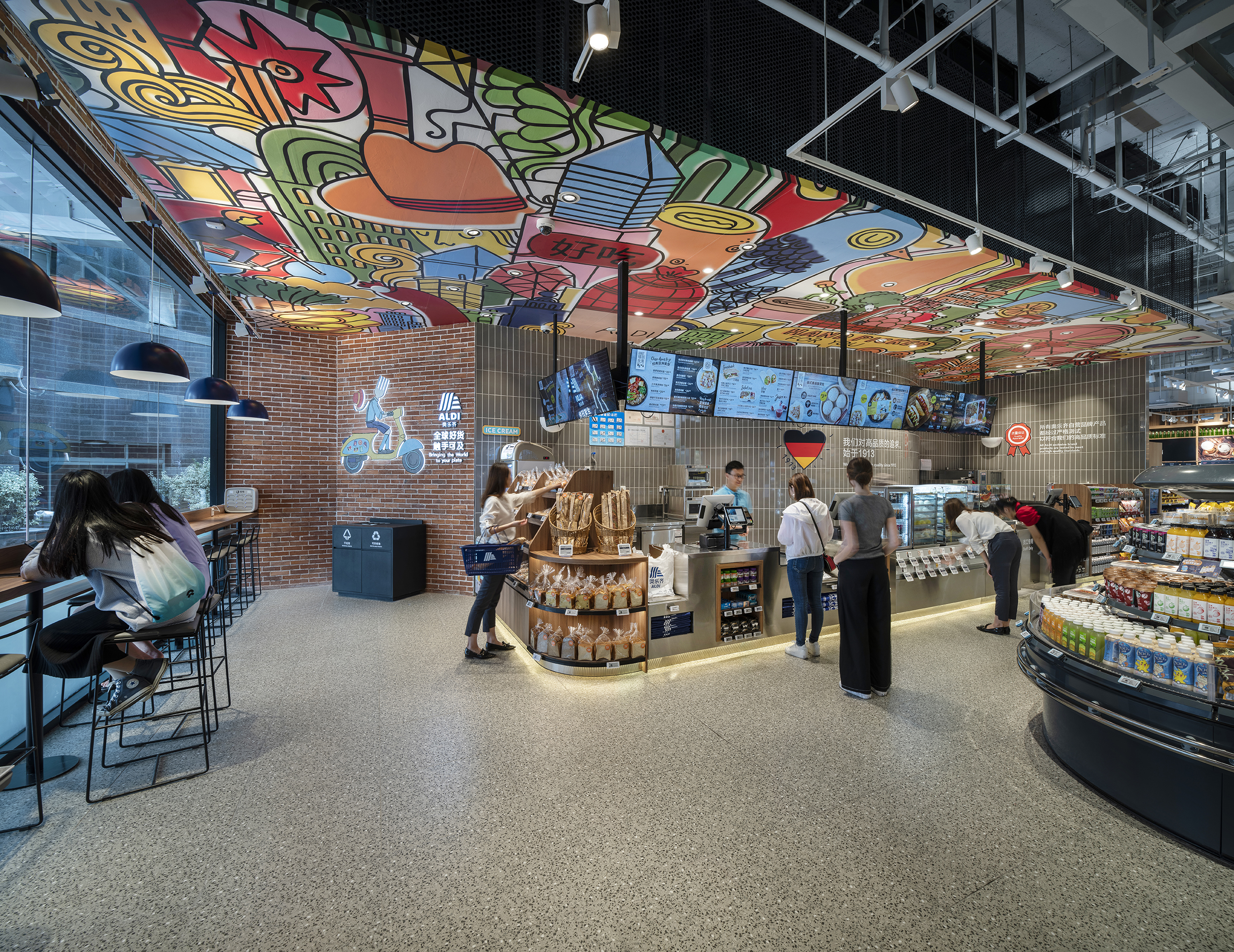
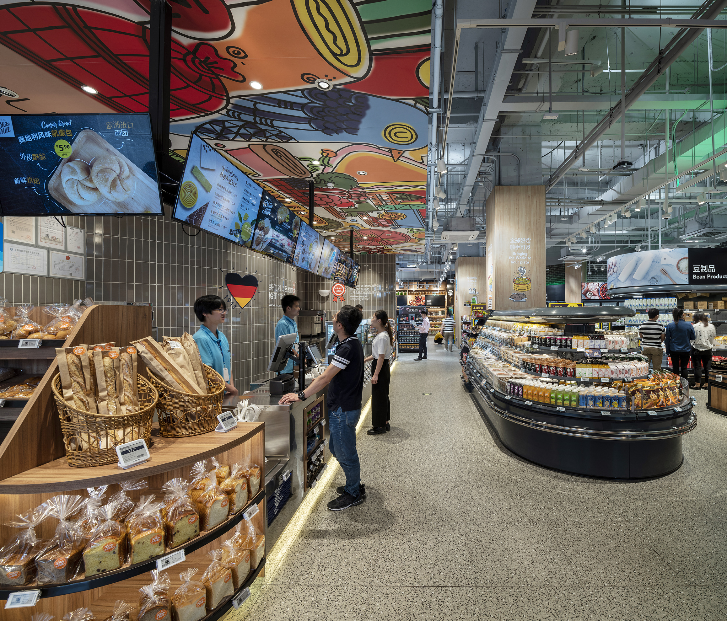
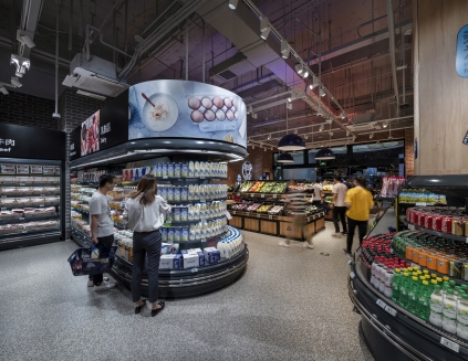
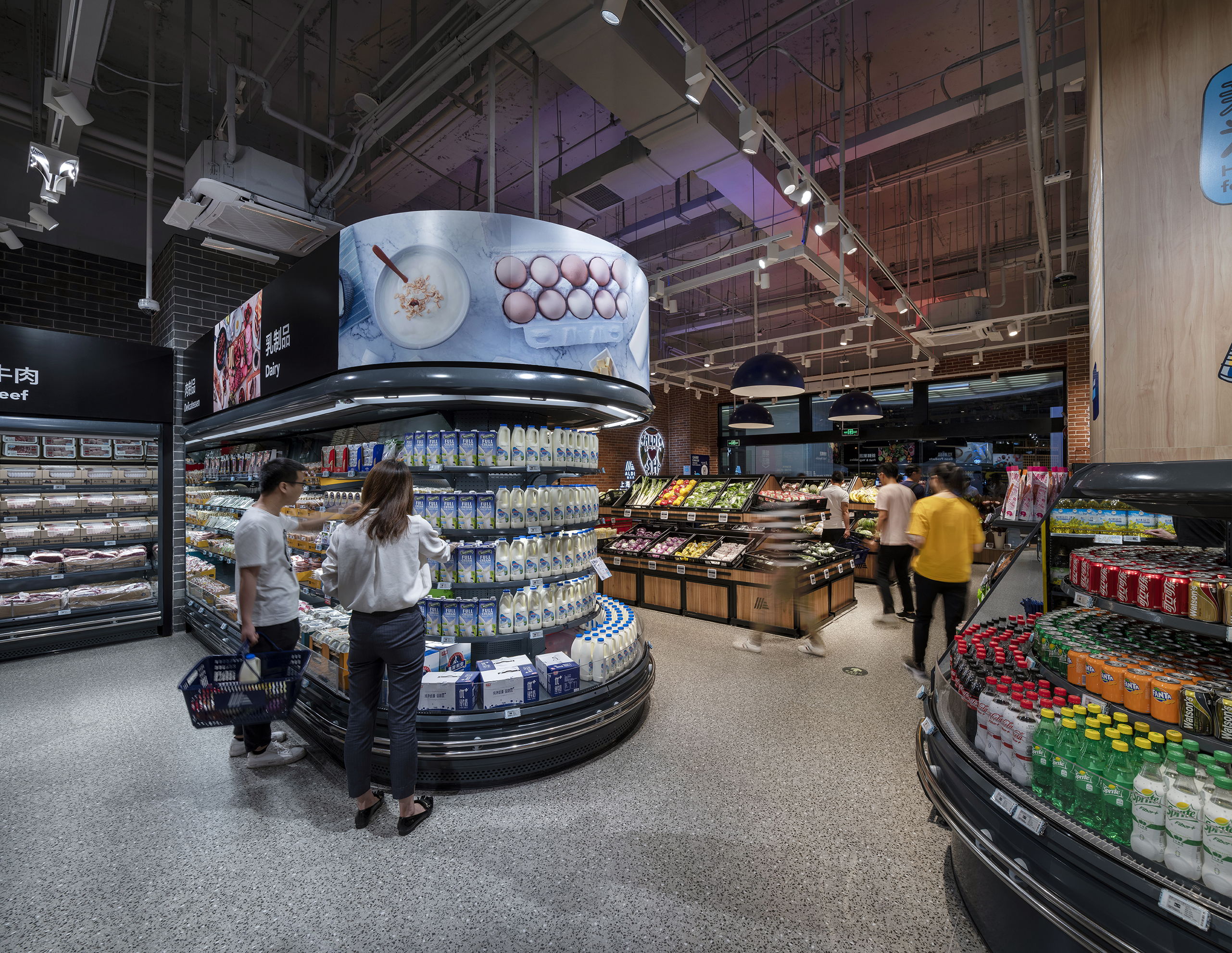
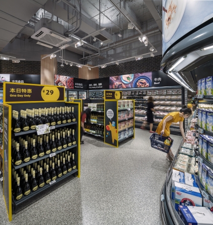
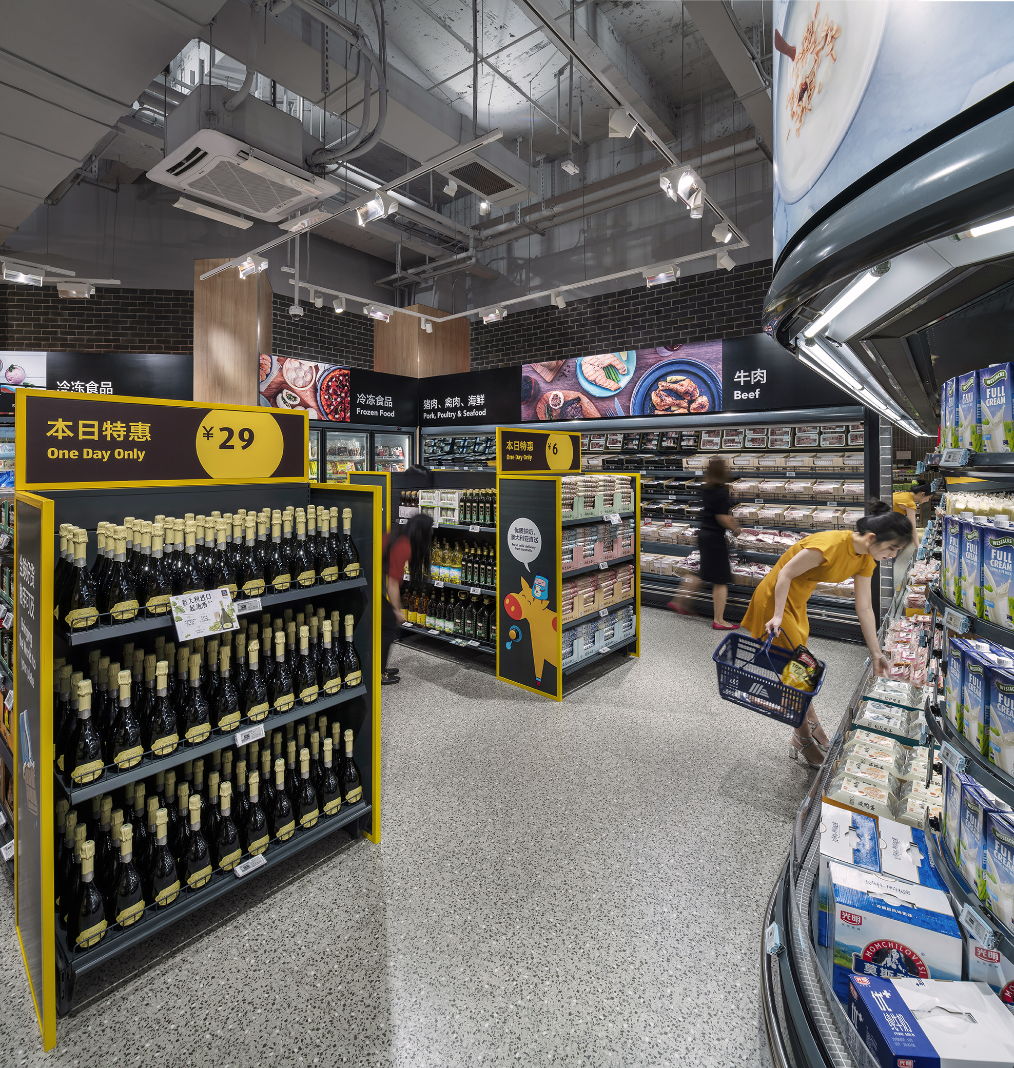
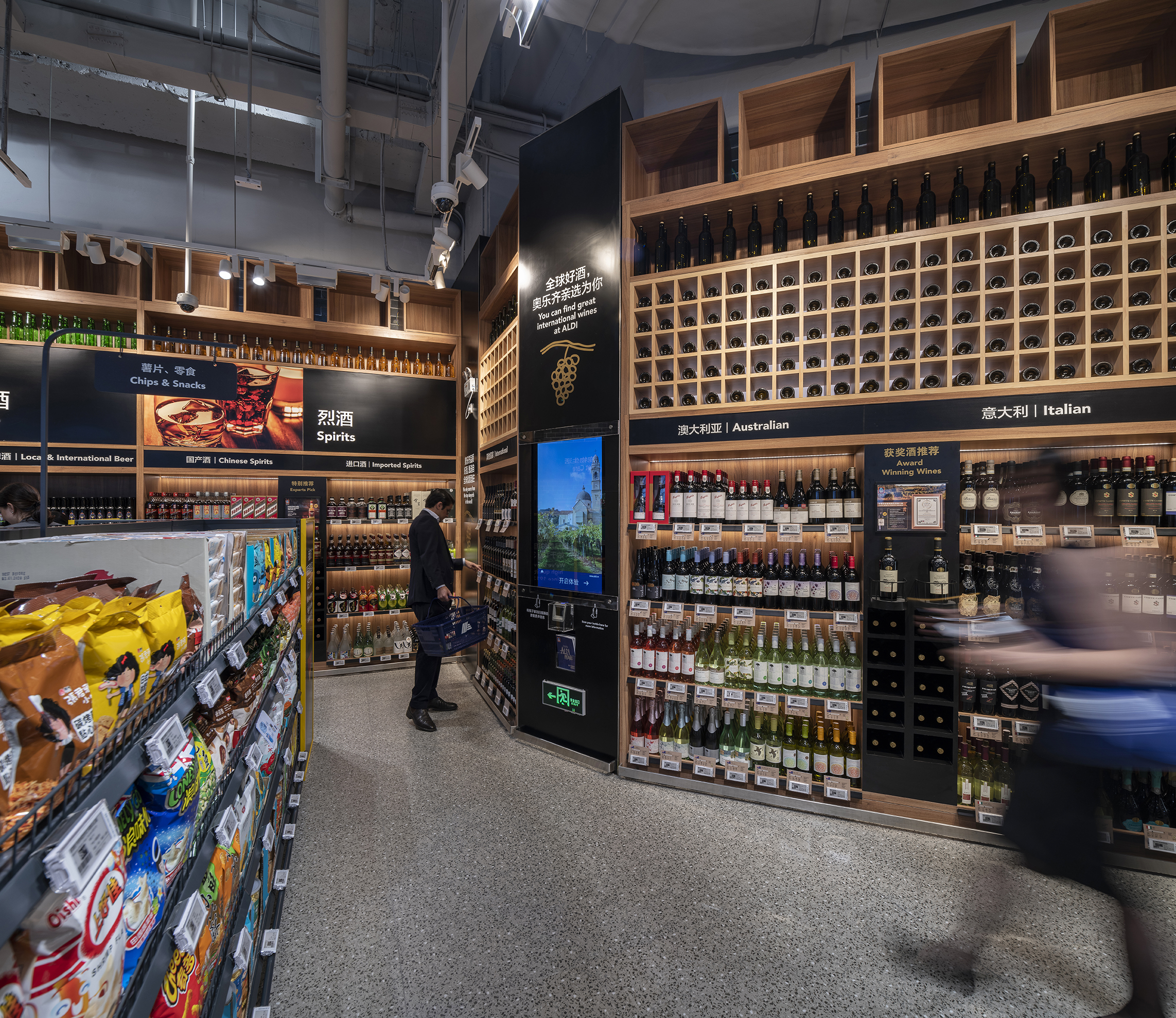
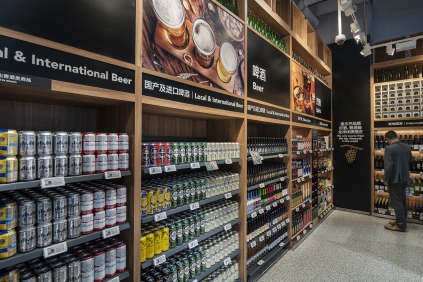
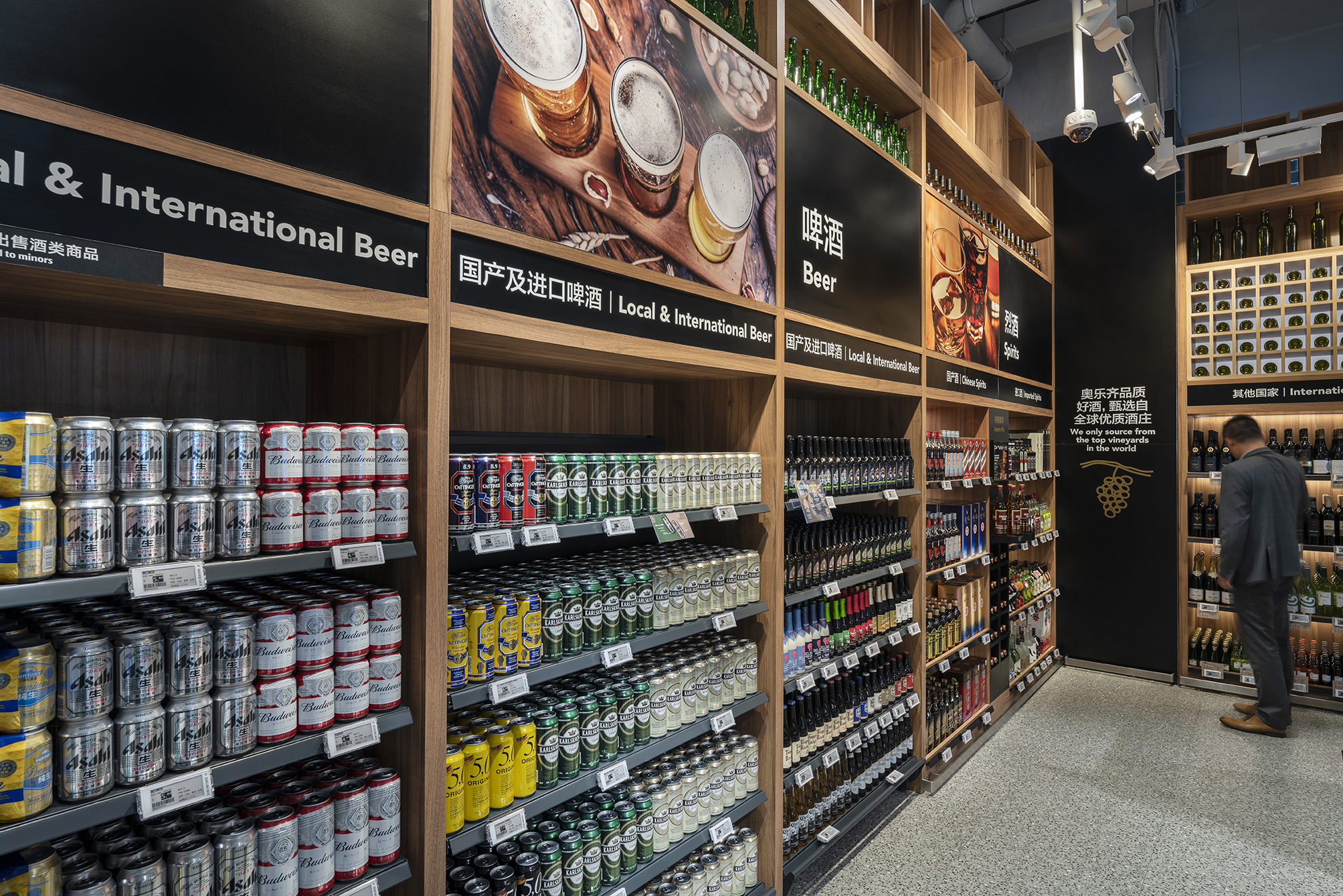
Landini Associates were engaged by Aldi China to design a new trading format for the brand ahead of their first entry into the Chinese market, commencing with two pilot stores opened last week in Shanghai. The new Chinese stores are a milestone for the German-rooted retailer and have drawn massive interest from both the media and public, with managed queues snaking outside both stores for hours upon opening. The format and design is an evolution of Landini Associates’ work for ALDI Australia, aimed at celebrating and conveying product quality and value. There are key differences however in scale, layout, and tone. In line with Chinese consumer habits, where the preference is to visit multiple small shops per week, the stores are a much smaller format. The emphasis is on fresh produce and ready meals, with certain categories articulated for greater consistency, and key products placed at the entry of each aisle alongside messaging to appeal to and drive shoppers. Key departments developed were snacks, produce, bakery, alcohol, imported goods, health, and beauty. The most noticeable difference for the Chinese market is the development of an on-site Food Station, as well as the addition of ready meals to take away or consume at the in-store dining kiosk. A palette of low cost yet real materials such as locally sourced brick, terrazzo, an open concrete ceiling, warm timbers, and yellow accents adds to the perception of freshness throughout the stores. LED lighting reduces glare and running costs whilst improving ambience and colour rendering, changing from day to night. The lighting was designed to create a pleasant atmosphere and let the products speak, enhancing its colour, texture, and freshness. Energy saving LED has also been incorporated in the fridges and in the wine displays. In tandem with the interiors, Landini Associates also designed an extensive series of messaging and graphic illustrations that are entirely unique to the Chinese market. Over 40 messaging boards were developed to communicate the brand ethos, product freshness, value, quality, and European and Australian award-winning products. In line with Landini design principles, there is no signage or ticketing displayed from the ceiling. Instead, category signage around the store perimeter offers greater visibility across the stores and thus encourage cross-store shopping. A vibrant, colourful mural on the ceiling above the service counter and checkouts is a playful hero graphics feature. Photography by Andrew Meredith. For more information please visit: www.landiniassociates.com