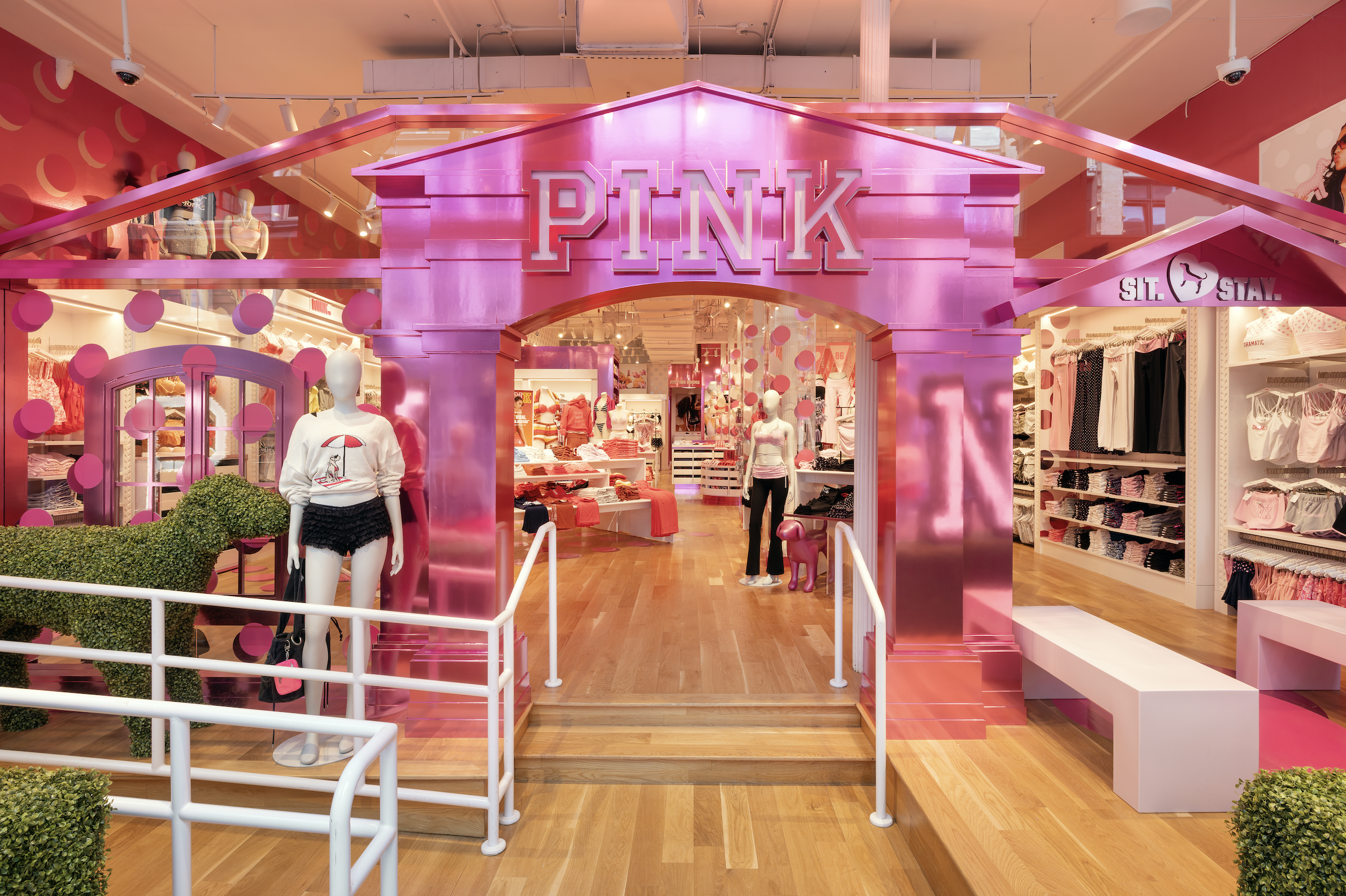
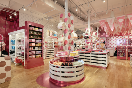
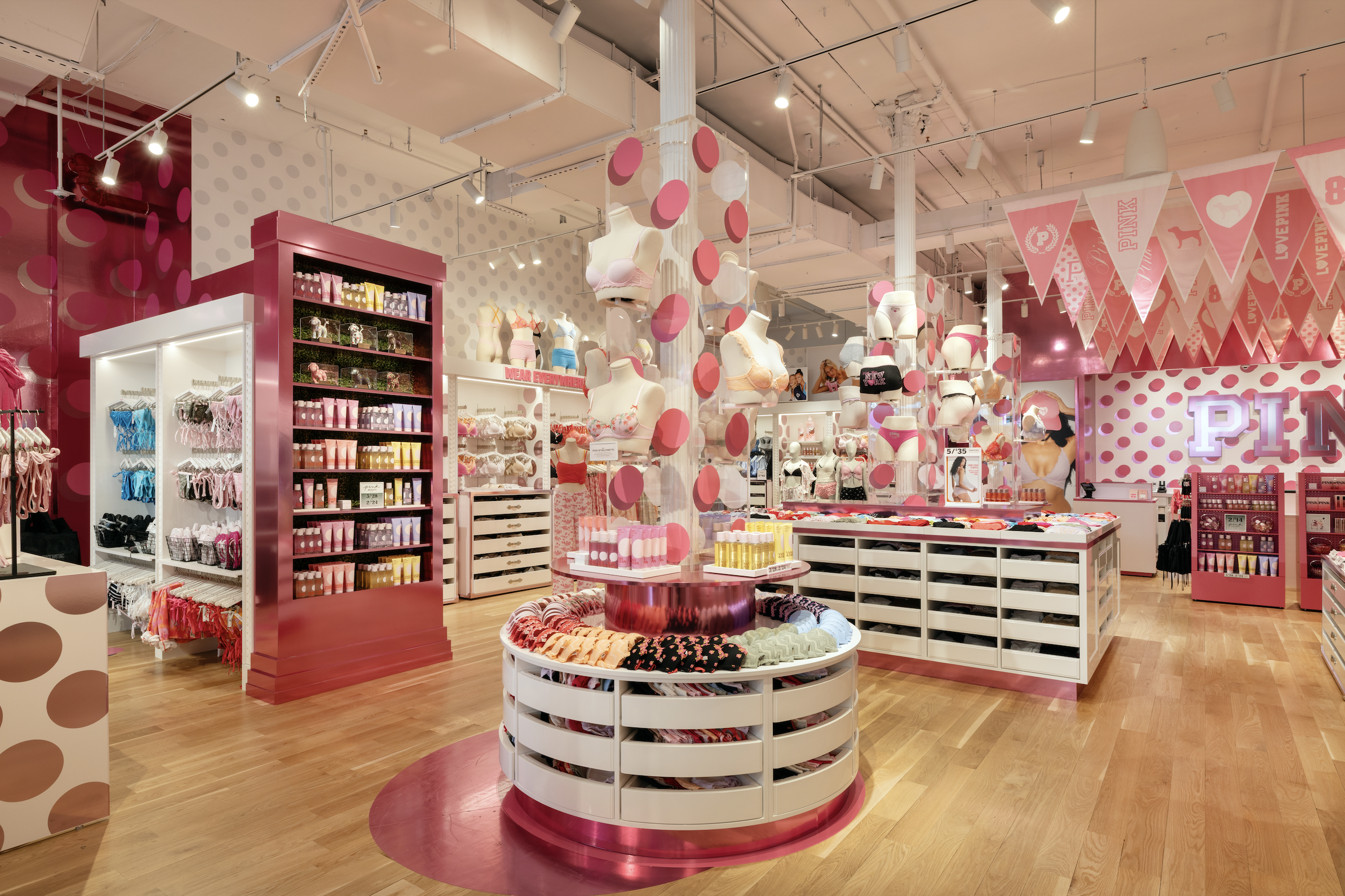
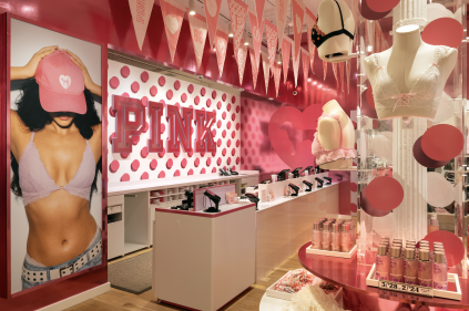
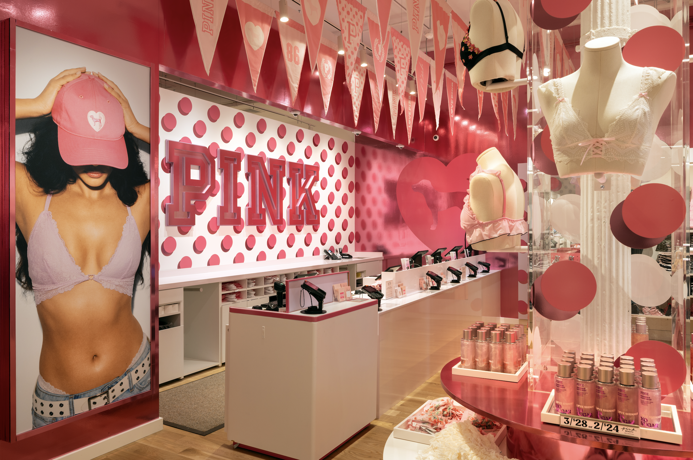
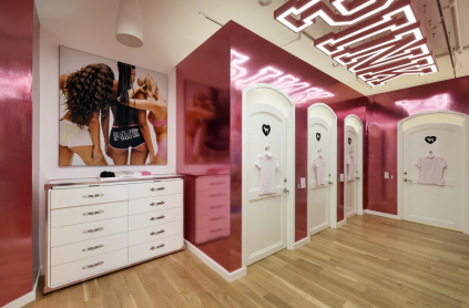
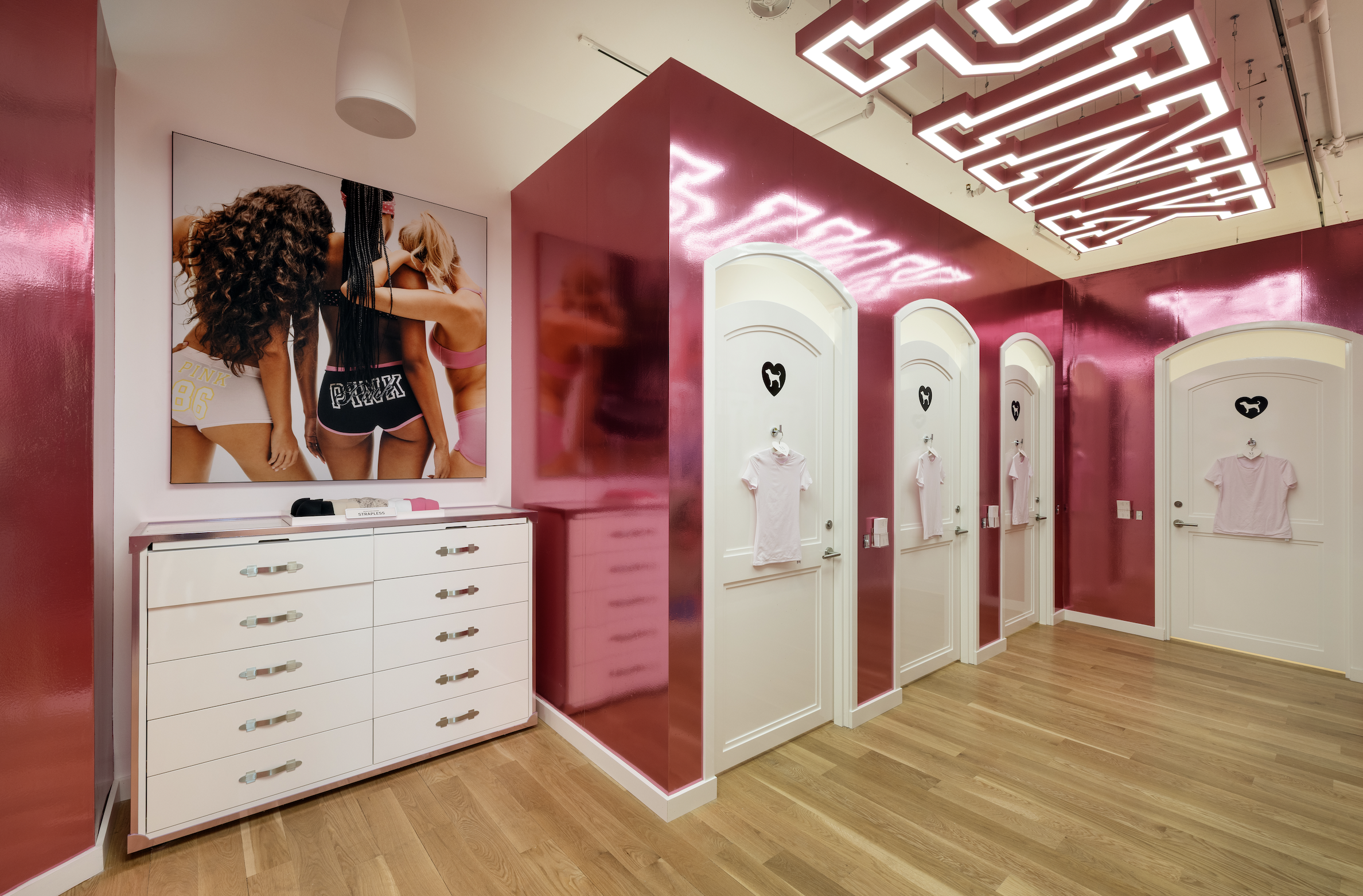
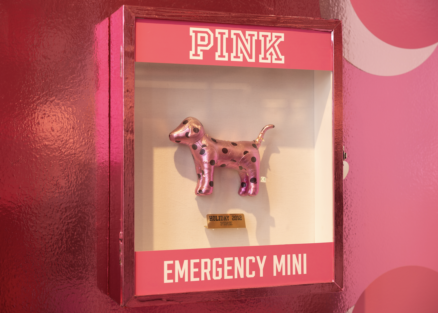
We led the creative direction and visual merchandising strategy for the PINK Soho pop-up, designed to capture attention in a high-traffic, fashion-forward environment while expressing a bold, elevated take on the brand.
The concept focused on a high...We led the creative direction and visual merchandising strategy for the PINK Soho pop-up, designed to capture attention in a high-traffic, fashion-forward environment while expressing a bold, elevated take on the brand.
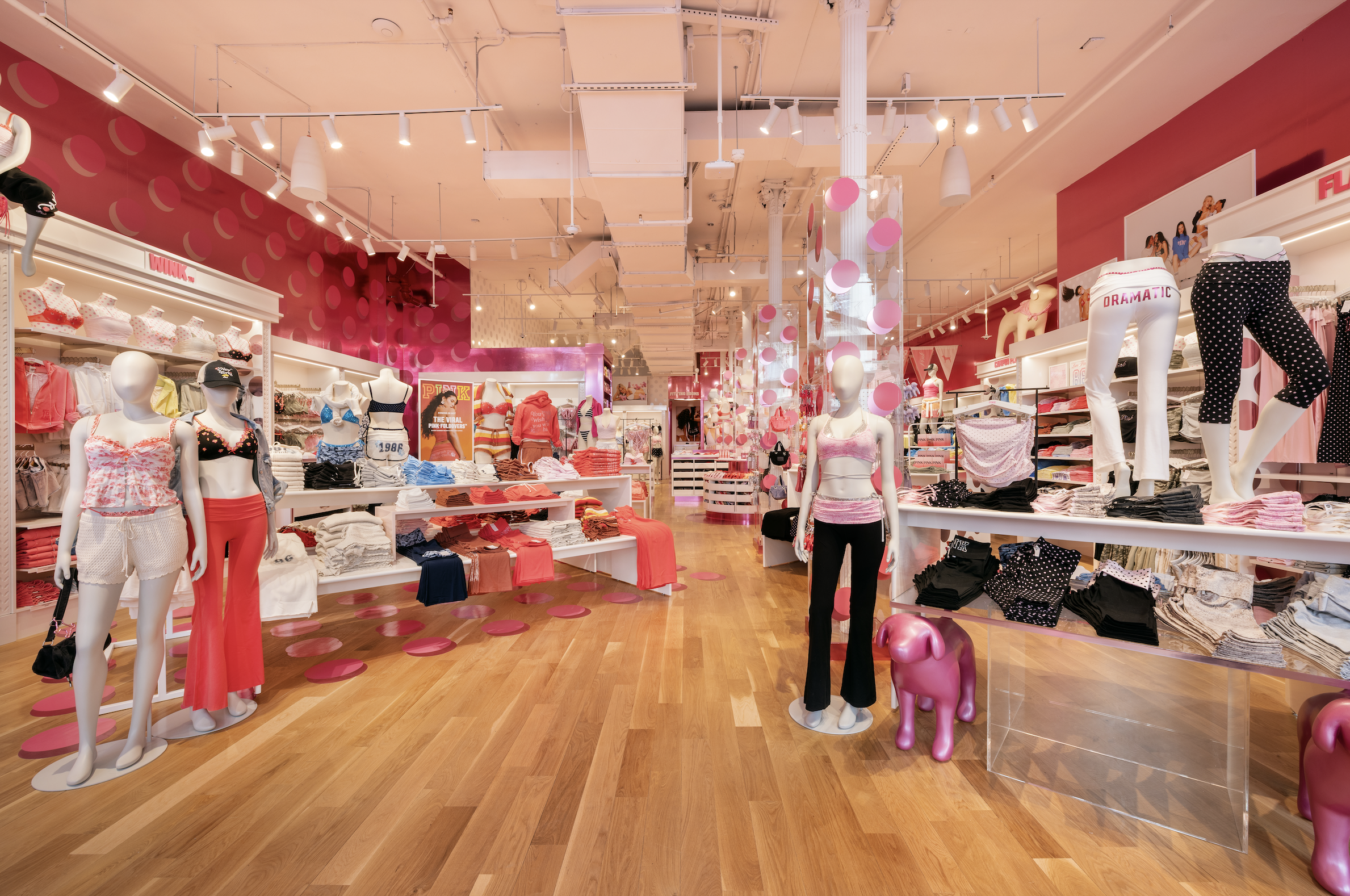
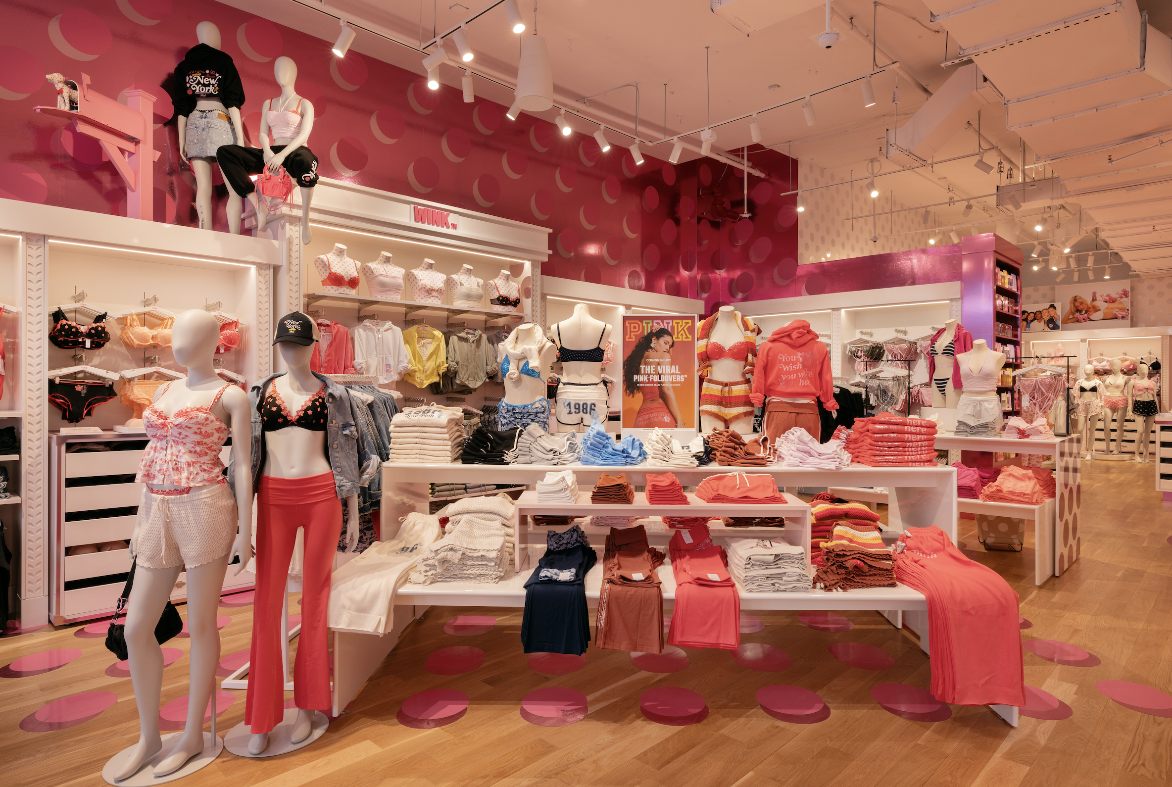
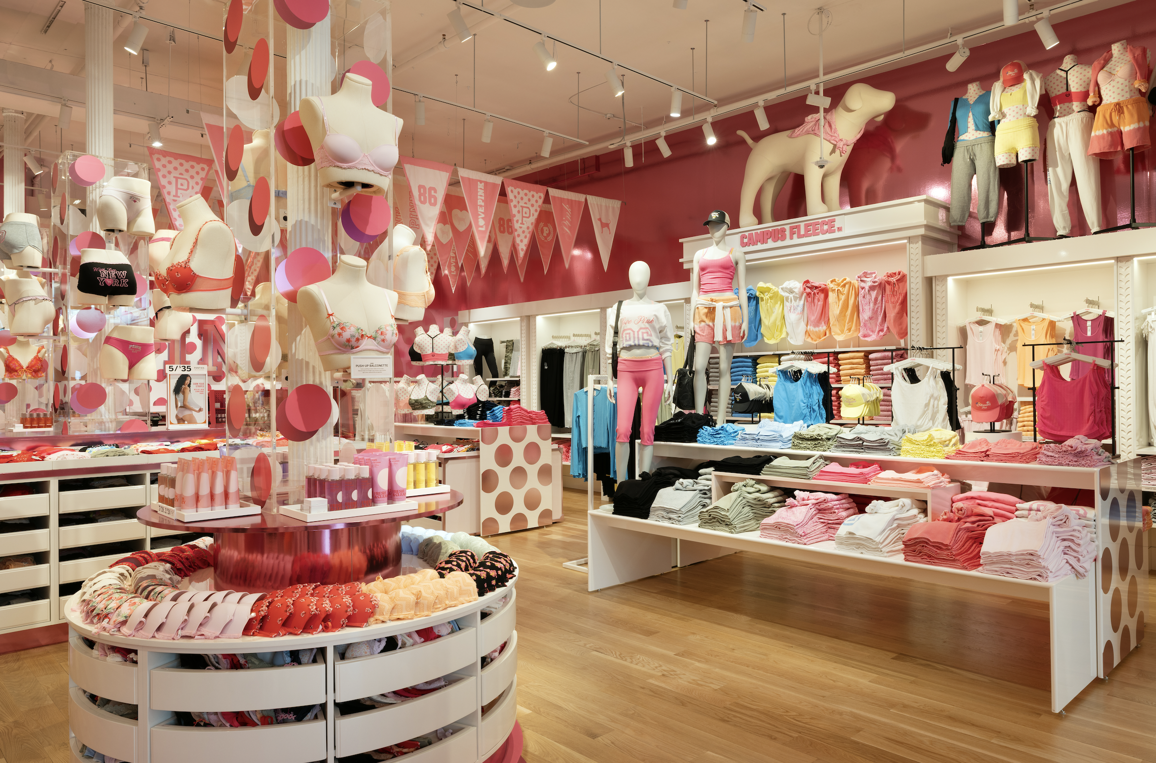
The concept focused on a high-impact, immersive pink environment—balancing playful energy with a more refined, editorial approach. We leaned into scale, saturation, and clean architectural moments to create a space that felt both highly shareable and intentional. Key elements included oversized color blocking, layered product storytelling, and dynamic sightlines that pulled customers through the experience.
From a merchandising perspective, the goal was to simplify and hero key product moments, allowing color and volume to do the heavy lifting while maintaining shopability. The layout was designed to support both discovery and quick conversion, with clear focal points and strong product adjacencies.
We worked cross-functionally with design, production, and store teams to bring the concept to life under tight timelines, ensuring alignment from ideation through installation. The result is a bold, culturally relevant expression of PINK in the Soho market—built to drive both traffic and social engagement.See More